Release Example: Favorite collection v0.1.0
简介
本文介绍了使用 React(Remix) v2.51.1 SPA + Material UI v6.2.0 进行界面设计的案例.
Materia UI 是一个流行的前端UI, 采用 MIT 协议发布。 可以实现多端UI设计(桌面端、手机端、平板端)。 国内较为流行的 AntD 目前仅支持桌面端,AntD Mobile 仅支持移动端。
Remix是React官方推荐的框架,同时支持SSR和SPA两种开发模式,可以理解为React附加路由版——这里说的路由就是一种通过不同url绑定不同的组件的方法,也就是能通过访问不同的url来显示不同的组件。
如果想部署Remix SPA 到桌面端可以使用Electron进行打包。 ,部署到桌面端可以使用Electron加载http-server方式实现。如果想在Electron使用Material-UI,可以直接使用现成的项目,没必要引入Remix,Remix 更合适做服务端UI开发,仅用 React + Electron 就能实现较好的桌面端开发效果(Remix会有各种报错)。
移动端可以参考 Capacitor 进行打包。(未验证)
初始化项目
git clone https://github.com/observerkei/vite-remix-spa-material-ui.git
cd remix-spa-material-ui
# 查看案例
# git checkout example
npm install
启动
npm run dev函数介绍
| 函数 | 简介 |
|---|---|
clientLoader | 浏览器 Get 请求这个路由页面的时候会加载这个函数。 |
useClientLoader | 默认导出组件中可以通过这个拿到 clientLoader 返回的内容 |
clientAction | 浏览器通过From发送 Post 请求的回调函数。 |
useClientAction | 在调用处可以通过clientAction拿到 Form 的返回结果。 |
useNavigate | 进行不刷新SPA跳转,需要注意组件需要有不同key才能重载。 |
redirect | 在路由回调(loader/action)中作为返回值,进行页面重定向。 |
React(Remix)文件路由简介
处于兼容性考虑,React可以尽量使用组件方式进行路由,而不是文件路由。react-router提供了组件路由方式。
| URL | Matched Route | Layout |
|---|---|---|
/ | app/routes/_index.tsx | app/root.tsx |
/about | app/routes/about.tsx | app/root.tsx |
/concerts | app/routes/concerts._index.tsx | app/routes/concerts.tsx |
/concerts/trending | app/routes/concerts.trending.tsx | app/routes/concerts.tsx |
/concerts/salt-lake-city | app/routes/concerts.$city.tsx | app/routes/concerts.tsx |
/concerts/mine | app/routes/concerts_.mine.tsx | app/root.tsx |
URL:是指浏览器访问的链接的路径,如主机是http://localhost:5173的情况下,第二行表示访问http://localhost:5173/about。Matched Route:是指访问这个URL的时候,会访问哪个文件里面的export loader/export action/export default function。Layout:是指Matched Route的默认组件(export default function)在哪个文件的<Outlet />位置进行渲染。 比如第一行的意思为,在app/root.tsx文件中的<Outlet />将被替换成app/routes/_index.tsx中export default function返回的内容。
相当于:
<root.tsx>
	<Outlet /> {/* 如果访问 `/`, 会调用 index.tsx 渲染内容,然后放到 Outlet 位置中渲染。 */}
<root.tsx>文件路由的文件名有下划线_的时候,
下划线在名称前面,表示保留这一层Layout渲染位置,但是不保留URL路径。
下划线在名称后面,表示保留URL路径,但是不保留Layout渲染位置(比如在单个页面实现登录、注册场景)。
也支持通过文件夹方式进行归类,但是因为文件名都必须是route.tsx,实际上编辑起来并不方便(还不如和最后一层同名不含下划线)。
通过浏览器缓存保存数据的方法
/**
 * 从 localStorage 获取数据
 * @param key - 要获取的数据的键
 * @param defaultValue - 如果 localStorage 中没有找到该键,返回的默认值
 * @returns 返回解析后的数据,如果未找到则返回 defaultValue
 */
export function getLocalData(key: string, defaultValue: any) {
  const value = localStorage.getItem(key);
  if (value && value.length > 0) {
    return JSON.parse(value);
  }

  return defaultValue;
}

/**
* 将数据存储到 localStorage
* @param key - 要存储的数据的键
* @param value - 要存储的数据
*/
export function setLocalData(key: string, value: any) {
  localStorage.setItem(key, JSON.stringify(value));
}
兼容Safari浏览器的日志接口
/**
 * 打印调试信息到控制台
 * @param params - 要打印的参数列表
 */
export function console_dbg(...params: any[]): void {
  if (!log_enable) return;

  try {
    throw new Error();
  } catch (error: any) {
    // Get stack info
    const stackLines = error.stack ? error.stack.split("\n") : [];
    let functionName = "anonymous";
    let lineNumber = "unknown line";

    for (let i = 0; i < stackLines.length; i++) {
      const line = stackLines[i].trim();

      // Filter out the stack information of the current function itself
      if (line.includes("console_dbg")) {
        continue;
      }

      // Handle stack formats for different browsers
      const chromePattern = /at (\S+) \((.*?):(\d+):\d+\)/;
      const safariPattern = /at (.*?)(?: \((.*?):(\d+):\d+\))?/;

      const match = line.match(chromePattern) || line.match(safariPattern);

      if (match) {
        functionName = match[1] || "anonymous";
        lineNumber = match[3] || "unknown line";
        break;
      }
    }

    // Log output with function name and line number
    console.log(`[${functionName}:${lineNumber}]`, ...params);
  }
}
自适应布局检测
import { useMediaQuery } from 'react-responsive';

export const mobileMaxWidth = 600;
export const desktopMinWidth = 1200;

// 移动端检测
const isMobile = useMediaQuery({ maxWidth: mobileMaxWidth });
// 桌面端检测, 介于桌面端和移动端之间的起始就是平板端。
const isDesktop = useMediaQuery({ minWidth: desktopMinWidth });
CSS简介
FlexBox 布局
盒子里面装载成员,而成员自己也可以作为盒子装在自己的子成员,也就是FlexBox支持嵌套使用.
尽量减少嵌套数量,嵌套数量越多,维护越困难,Bug越容易增多,越不可控,尽量过渡到Gird布局。
盒子参数
| 参数 | 说明 |
|---|---|
display: flex | 表示这是一个盒子,使用FlexBox布局 |
flexDirection: column | 修改主轴方向为竖直方向。默认是row(水平方向) |
justifyContent: space-between | 主轴方向上两端对齐 |
alignItems: stretch | 交叉轴方向上占满剩余空间 |
成员参数
| 参数 | 说明 |
|---|---|
alignSelf: center | 修改成员自己的对齐方式 |
height: 100% | 占满父组件剩余高度 |
width: 100% | 占满父组件剩余宽度 |
iframe 设置透明背景
- 设置iframe是透明的,注意要有
color-scheme: light;才能设置透明
<div>
  <iframe
    id="dino-item-iframe"
    src="src-url"
    frameborder="0"
    scrolling="no"
    width="100%"
    height="185px"
    loading="lazy"
    style="overflow: hidden; margin: 0; background: transparent; color-scheme: light;"
  >
  </iframe>
</div>- 设置
src-url的页面是透明的
body {
  background: transparent;
}
Material UI 的一些组件介绍
| 组件 | 备注 |
|---|---|
| Tooltip | 浮动提示字体 |
| Drawer | 折叠侧边栏,需要注意的是,里面会附带一个Main样式,这个样式将边框和内边距设定为0后,里面不能再套div/Box,不然会有莫名其妙的底部边距。 |
自适应高度的List
上、中、下 分别使用:
上: flex: 0 0 auto
中: flex: 1 1 auto 中间是自适应的。
下: flex: 0 0 auto
flex: flexGrow flexShrink flexBase
flex是缩写形式。
flexGrow: 1 表示提高占用比例,如果flex里面只有这个是 1, 则表示占用所有剩余空间; 0 表示不能缩放,默认 0。
flexShrink: 1 表示不缩小 0 表示可以被缩小,
flexBasis: 表示元素初始长度, 目前还没有用到,默认 auto.
import Drawer from '@mui/material/Drawer';
import List from '@mui/material/List';
import Box from '@mui/material/Box';
import { styled } from '@mui/material/styles';


const DrawerHeader = styled('div')(({ theme }) => ({
  display: 'flex',
  alignItems: 'center',
  justifyContent: 'flex-end',
  flex: "0 0 auto"
}));

export default function App() {
  return (
    <Drawer
      sx={{
        width: drawerWidth,
        flexShrink: 0,
        '& .MuiDrawer-paper': {
          width: drawerWidth,
          boxSizing: 'border-box',
        },
        display: 'flex',
        flexDirection: 'column',
      }}
    >
      <DrawerHeader />
      <List
        dense
        sx={{
          flex: "1 1 auto",
          width: '100%',
          flexGrow: '1',
          position: 'relative',
          overflow: 'auto',
          '& ul': { padding: 0 },
        }}
      >
        {/* 组件内容 */}
      </List>
      <Box
        sx={{
          flex: "0 0 auto",
          display: 'flex',
          alignItems: 'center',
          flexDirection: 'column',
          justifyContent: 'center',
          padding: '10px',
        }}
      >
        {/* 组件内容 */}
      </Box>
    </Drawer>
  )
}
圆角
通过 borderRadius 进行控制。
按钮圆角
// import Button from '@mui/material/Button';

<Button
  sx={{
    borderRadius: 28,
  }}
>
	ADD
</Button>
输入框圆角
// import TextField from '@mui/material/TextField';

<TextField
  slotProps={{
    input: { sx: { borderRadius: 20 } },
  }}
/>
悬浮提示框圆角
import { styled } from '@mui/material/styles';
import Tooltip, { TooltipProps, tooltipClasses } from '@mui/material/Tooltip';

export const CustomWidthTooltip = styled(({ className, ...props }: TooltipProps) => (
  <Tooltip {...props} classes={{ popper: className }} />
))({
  [`& .${tooltipClasses.tooltip}`]: {
    borderRadius: 28,
  },
});
TextField 颜色控制
通过官方提供的color参数可以修改预定义主色调,但是不能自定义失焦颜色。
用以下方法可以自定义,
focused是修改聚焦颜色,没有则修改默认颜色。 不过不建议这么修改,换版本的时候很容易出问题。
<TextField
  sx={[
    {
      // Root class for the input field
      "& .MuiOutlinedInput-root": {
        color: unFocusColor,
        fontFamily: "Arial",
        fontWeight: "bold",
        // Class for the border around the input field
        "& .MuiOutlinedInput-notchedOutline": {
          borderColor: unFocusColor,
          borderWidth: "2px",
        },
        "&.Mui-focused": {
          "& .MuiOutlinedInput-notchedOutline": {
            borderColor: focusColor,
          },
        },
      },
      // Class for the label of the input field
      "& .MuiInputLabel-outlined": {
        color: unFocusColor,
        fontWeight: "bold",
        "&.Mui-focused": {
          color: focusColor,
        },
      },
      "& .Mui-focused": {
        // It must be '&.' or it won't work
        "&.MuiOutlinedInput-root": {
          color: focusColor,
        }
      },
    },
  ]}
/>
TypeScript 的一些语法
定义枚举
enum PageType {
  UNDEFINE = "UNDEFINE",
  HOME = "Home Page",
  CONTACT_EDIT = "Contact Edit Page",
  CONTACT_DESCRIPT = "Discript Page",
}
定义函数参数
type params = {
  contact: ContactRecord;
  labelId: string;
  handleToggle: any;
}

function Favorite({ contact, handleToggle, labelId }: params) {
  return (
    <>Favorite</>
  )
}
Electron通过http-server打包
打包环境配置流程可以参考这个文章: 基于Electron的React(Next.js)多平台桌面应用构建
这里只用到了展示功能,如果要调用Electorn的API,有其他开源项目可以解决这个问题,如果是已有SPA项目使用了这个方法,那么需要再额外写Electron的API,然后用单独服务去运行,相当于Electron作为API服务端,而页面显示的部分分为展示端。这样的话,为了API安全性,还需要在调用处做安全校验才行。
具体可以参考:在 Electron 的 preload.js 通过IPC将API暴露给渲染进程。
package.json
// package.json
   ...
+  "main": "main.cjs",
+  "author": "observerkei",
+  "description": "Test App",
+  "license": "MIT",
+  "version": "0.1.0",
   "scripts": {
+    "dev": "remix vite:dev --host=0.0.0.0 --port=3000",
+    "edev": "concurrently -n \"REMIX,ELECTRON\" -c \"yellow,blue\" --kill-others \"npm run dev\" \"electron .\"",
+    "emake": "npm run build && electron-forge make",
+    "epack": "electron-forge package",
+    "ebuild": "npm run build && npm run epack",
     ...
   },
   ...
main.cjs
// main.cjs

const { app, BrowserWindow } = require('electron');
const http = require('http-server');
const path = require('node:path');


// ? route to index
const creatHomeURL = (port) => `http://localhost:${port}?`;

const getRandomPort = () => {
  const min = 1024;
  const max = 65535;
  return Math.floor(Math.random() * (max - min + 1)) + min;
};

const startServer = (port, rootPath, count) => {
  let server;
  while (count < 1000) {
    try {
      server = http.createServer({ root: rootPath, proxy: creatHomeURL(port) });
      server.listen(port);
      console.log(`Server is running at http://localhost:${port}`);
      return port;
    } catch (e) {
      console.error(`Port ${port} is in use. Trying another...`);
      port = getRandomPort();
    }
  }

  return 0;
}

function checkURLToShow(win, url, retries = 10) {
  let attempts = 0;

  const interval = setInterval(() => {
    fetch(url)
      .then(response => {
        if (response.ok) {
          clearInterval(interval); // Stop checking once URL is accessible
          win.show();  // Show the window
          console.log('URL is accessible. Window shown.');
        }
      })
      .catch(() => {
        attempts++;
        console.log(`Attempt ${attempts}: URL is not accessible.`);
        if (attempts >= retries) {
          win.show();  // Show the window
          clearInterval(interval); // Stop after 10 attempts
          console.log('Max retries reached. URL is still not accessible.');
        }
      });
  }, 1000);  // Check every second
}

function createWindow() {
  const win = new BrowserWindow({
    width: 1280,
    height: 720,
    minWidth: 400,
    minHeight: 300,
    show: false,
    webPreferences: {
      preload: path.join(__dirname, 'preload.js')
    }
  })

  let port = 5173;
  let homeURL = creatHomeURL(port);

  // Different paths to adapt development mode and run mode
  if (app.isPackaged) { // pack
    port = startServer(getRandomPort(), path.join(process.resourcesPath, 'client'), 0);
    homeURL = creatHomeURL(port);
  }

  win.loadURL(homeURL);

  if (app.isPackaged) {
    win.once('ready-to-show', (event) => {
      win.show();
    })
  } else {
    checkURLToShow(win, homeURL)
  }

  // Exit the application when the window closes
  win.on('close', (event) => {
    app.quit();
  });
}

app.whenReady().then(() => {
  createWindow();

  app.on('activate', () => {
    if (BrowserWindow.getAllWindows().length === 0) {
      createWindow();
    }
  })
})

app.on('window-all-closed', () => {
  if (process.platform !== 'darwin') {
    app.quit();
  }
})
preload.js
// preload.js

// 所有的 Node.js API接口 都可以在 preload 进程中被调用.
// 它拥有与Chrome扩展一样的沙盒。
window.addEventListener('DOMContentLoaded', () => {
  const replaceText = (selector, text) => {
    const element = document.getElementById(selector)
    if (element) element.innerText = text
  }

  for (const dependency of ['chrome', 'node', 'electron']) {
    replaceText(`${dependency}-version`, process.versions[dependency])
  }
})
forge.config.cjs
// forge.config.cjs

const { FusesPlugin } = require('@electron-forge/plugin-fuses');
const { FuseV1Options, FuseVersion } = require('@electron/fuses');

module.exports = {
  packagerConfig: {
    icon: './public/favicon.ico',
    asar: true,
    ignore: [
        "^/app/.*$",
        "^/build/.*$",
        "^/components/.*$",
        "^/public/.*$",
    ],
    extraResource: [
      "./build/client/",
      "./public/favicon.ico",
    ],
  },
  rebuildConfig: {},
  makers: [
    {
      name: '@electron-forge/maker-zip',
      platforms: ['win32', 'darwin'],
    },
    {
      name: '@electron-forge/maker-deb',
      config: {},
    },
    {
      name: '@electron-forge/maker-rpm',
      config: {},
    },
  ],
  plugins: [
    {
      name: '@electron-forge/plugin-auto-unpack-natives',
      config: {},
    },
    // Fuses are used to enable/disable various Electron functionality
    // at package time, before code signing the application
    new FusesPlugin({
      version: FuseVersion.V1,
      [FuseV1Options.RunAsNode]: false,
      [FuseV1Options.EnableCookieEncryption]: true,
      [FuseV1Options.EnableNodeOptionsEnvironmentVariable]: false,
      [FuseV1Options.EnableNodeCliInspectArguments]: false,
      [FuseV1Options.EnableEmbeddedAsarIntegrityValidation]: true,
      [FuseV1Options.OnlyLoadAppFromAsar]: true,
    }),
  ],
};
安装打包依赖
构建打包配置,默认同意选项即可,如果询问是否向 package.json 添加命令的时候,选否
npm exec --package=@electron-forge/cli -c "electron-forge import"
yarn install
打包
npm run build
npm run emake
打包后,文件在 ./out/make/ 里面。
碰到的问题
Vite Remix SPA 现阶段还不支持 Material UI
就 Material UI 官方发布的非Vite版本做迁移到 Vite Remix 中,根据其他人的提示进行主题样式适配,删除了entry.server.tsx,已经做成模板:Vite Remix v2.51.1 SPA material UI v6.2.0 template
Remix 不支持导入 ES modules
在SPA模式下,运行、编译会有如下报错:
is not supported resolving ES modules imported 查阅了大量资料后,在 vite.config.ts 添加以下参数终于解决:
// vite.config.ts
export default defineConfig({
	ssr: {
		noExternal: [
			"@mui/*", // fix material-ui ES modules imported error.
		],
	},
});
黑色主题下画面闪白一下后才黑屏
解决方法是一开始的时候,就通过css设置背景为黑色,然后通过主题控制背景。
模板已经封装好黑白主题的应用,可以直接使用。
移动端Chrome按下回车会切换焦点而不是提交
因为 input 的type导致的,需要设置为type=search。
这样修改即可:
<input
  type="search"
  onClick={(event) => {
    const EnterCode = 13;
    if (event.key === "Enter" || event.keyCode === EnterCode) {
      alert('pass Enter: on Key Down');
    }
  }}
/>
表单提交 Form 无法嵌套使用
不指明From的Action方法,而是通过按钮点击事件修改From组件再提交即可。 我是在进行From按钮布局的时候碰到这个问题的。
import Button from '@mui/material/Button';


type params = {
  editContact: ContactRecord;
  Form: any; // import { Form } from '@remix-run/react';
}

export default function ({ editContact, Form }) {
  const handleActionChange = (path: string) => {
    if (formRef.current) {
      // Set the action property dynamically
      formRef.current.action = path;
    }
  };
  return (
    <Form
      id="contact-from"
      ref={formRef}
      method="post"
    >
      <Button
        variant="contained"
        type="submit"
        onClick={() => handleActionChange(`/c/${editContact.id}/edit`)}
      >
        Save
      </Button>
      <Button
        color='error'
        variant="contained"
        type="submit"
        onClick={() => handleActionChange(`/c/${editContact.id}/delete`)}
      >
        Delete
      </Button>
    </Form>
  )
}
页面跳转后内容没有重载
因为组件没有填写key导致的,React官方文档有写不加Key会有莫名其妙的问题。
Remix SPA打包无法用Electron的loadFile加载
会提示路径错误、直接通过Vite替换资源路径前缀并不行,引入的Remix代码里面写死了资源位置。
有人也提供了一种旧版Remix通过Electron运行的方法,旧版不支持Vite。
这里只涉及到UI展示,因此直接使用了http-server进行加载,加载代码见 http-server-main.cjs;
http-server运行SPA打包时无法进行页面路由
给http-server加个代理参数即可,命令行运行的时候,参数如下:
# 最后的 ? 不能少。
http-server --port 8080 -P http://localhost:8080?
代码里面调用的话,通过源码可以知道要这样子传参:
// .cjs

const http = require('http-server');

const rootPath = 'public/client'; // 生成index.html文件后, index.html 所在的路径
const creatHomeURL = (port) => `http://localhost:${port}?`; // 最后的 ? 不能少
let port = 8080;

http.createServer({ root: rootPath, proxy: creatHomeURL(port) });
server.listen(port);iframe无法设置透明背景
因为iframe缺少了 color-scheme: light; 的 style 选项导致的。
具体用法看 [[#iframe-设置透明背景|iframe 设置透明背景]]
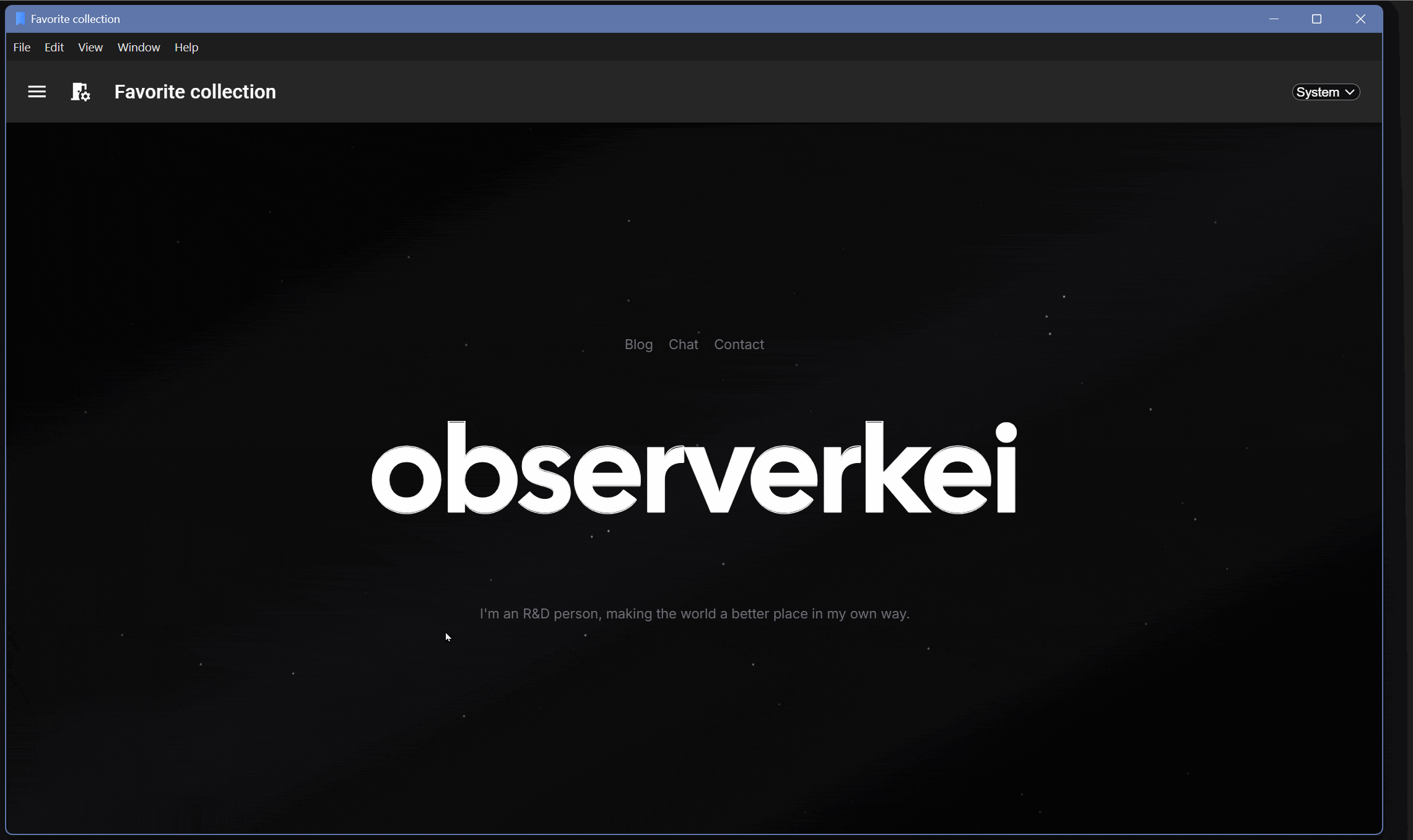
一个成品演示
Release Example: Favorite collection v0.1.0
功能简介
- 可以修改默认主页,如果不是主页,则修改按钮默认隐藏
- 搜索功能:可以通过名称搜索收藏
- 修改收藏功能
- 可以删除收藏
- 可以新建收藏
- 可以编辑、保存收藏,编辑时可以预览头像。选中收藏的时候才显示编辑按钮
- 保存收藏的选中状态
- 可以标记红心
- 点击收藏后,可以访问详情页面,详情页面不存在的时候,自动跳转编辑收藏页面
- 侧边栏
- 可折叠、收起侧栏,
- 手机页面可通过点击阴影处关闭侧栏,手机页面侧栏是堆叠形式,不同时挤占手机屏幕。
- 平板、电脑页面可以侧栏和内容同时显示,电脑收藏编辑页面自动调整布局利用宽屏空间。
- 侧栏开启时自动隐藏顶部应用条的侧栏开启按钮。
- 自动保存侧边栏开启状态
- 样式、布局。
- 按钮、主页框、主题选择框使用圆角样式
- 三端自适应布局:桌面、手机、平板。
- 可以修改主题,支持跟随系统主题、黑色主题、白色主题。
- 可操作功能有悬浮提示。
- 默认页、编辑页、详情页自动修改显示标题、顶部应用条名称。
- 可以全屏访问收藏页面,如果未填写收藏页面,则全屏按钮隐藏。
收益
- 多端响应式布局:支持自适应手机、平板、电脑窗口大小。
- 支持多色主题:支持夜间模式,支持主题色调自定义。
- 组件自带动画:Materia UI的组件自带动画。
- 组件化开发:依托于React实现各个功能,代码复用成本低,也能使用其他人开发好的React组件。
- 本地化存储:通过浏览器缓存实现本地化存储。
- 支持SPA部署:网页的运行本身不需要服务器参与页面渲染。
- 社区生态:依托于React社区的活跃,碰到的问题可能已经有人问过,并被解决了。